My Last Happie Scrappie Box

Hello my Lovelies 🙂
I was a little bit surprised because I totally forgot to talk with you about my last Happie Scrappie Subscription box. So I would like to catch up on that and share my experiences with you.
As you may know, I love a good subscription box because I get every month a little surprise and they have a special theme so everything matches together. Happie Scrappie had such a box. However, the creator decided to end the subscription boxes but you can still buy them individually at her shop. You can also buy digital printables, charms & pins, sticker albums, and lots more.
The Subscription
Well, the box cost 29,99 Euros per month which was a really good price. Normally you got 8 – 12 items like:
- patterned papers / vellums
- inserts
- date cover stickers
- Happie Scrappie exclusive stickers
- planner charm / fabric patch
- foiled stickers / washi tape
- pen / highlighter
- paper clips / magnetic bookmarks
- die cuts
- digital downloads
It was really a lot and I was excited in the beginning. Unfortunately, I didn’t have the chance to experience the boxes for a long time because I subscripted in February 2020; in May and June 2020 there wasn’t a box, and the last as well as final box was in July 2020. Well, bad luck for me, I thought. But my streak of bad luck starts at the beginning. I waited for all of my boxes at least two to three months after I got the tracking number. I was crazy. I think that everything happened during COVID-19 had such impacts too.
My Box Arrived
I waited till 29th of September 2020 to get my final box. I knew the theme would be Foodie’s Delight and the collaboration was with an artist called Molly who draws and paints in a very, very cute style.
I was so excited when took it out of the mailbox, went up the stairs into our flat and opened it up. Oh boy, there hit me a smell which wasn’t nice at all. I had never had a box before which was stinky. I am sorry to say but it really was stinky. It smelled like plastic, glue and a little bit burnt. My excitement dropped a bit and I put it on the balcony so it could get some air.
Then I started again. I was a little bit disappointed that the box didn’t represent the theme on the outside. Those boxes before had matched together everything. There had always been a sticker to seal the box which you could remove easily. This time the sticker wasn’t easy to remove, so it teared off the paper. After that the box fell apart. The box wasn’t really glued together. That wasn’t the quality I expected.
Inside the Box
At first, let me give you a list of all the items which were inside this final box:
- glitter pink date stickers
- plastic die cuts
- plastic rainbow heart stickers
- rainbow date stickers
- plastic rainbox tabs
- two sheets of rainbow box stickers
- cute little food stickers
- a sheet of star stickers – looked like for to do lists
- a sheet of the week days in rainbow colours
- a sheet of plastic boarders / dividers
- 4 rainbow with food on it pockets in different sizes
- transperent notepad with ice cream on it
- a pen plus a refill
- rainbow dots on a roll
- a little charm with cotton candy on it
- four washi cards with different food on it
- little rainbow sticky notes
- a notebook TN seize
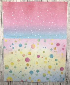
- colourful paper and vellum with silver print on it
That was A LOT! A huge amount and I still really appreciate it. Unfortunately, I have to say BUT because it wasn’t the quality I was used to get. In Germany we say if some products aren’t good quality or it gets broken really fast, you got yourself a „Montagsauto“ (a car which was produced on Monday). Everything which is built on a Monday isn’t the quality what you get if it was made on another day (well, at least according to modern legend). It is just a common term but it seemed to fit for the box too.

First things first, I like the colours. They were cheerful and bright. It wasn’t everything in pink and the little food designs were amazing.
The notebook, for example, had pink, yellow, and blue at the background of the cover and at the center you see a cute cotton candy stand. When you open the notebook, the colour gradient was from pink to velvet to blue with leave prints and a hot dog truck. The paper is dotted with square boxes on it. I love the idea of having colour gradient but I didn’t understand why it had to be two different ones.

The two vellums were printed with silver motives. One is with hearts and stars and the other one with leaves. So the paper sheets had different designs on each side. You have leaves in silver with bubbles with different colour gradients on it. The other side had the food stands and truck with little stars on it and the background is pink to blue. The second paper sheet has silver hearts and stars on it while the background is an intense pink to light blue. The other side has the same colour gradient as the notebook cover but the prints are ice cream, hot dogs, popcorn and flowers. There are white hearts as well.
There was a lot going on on the paper. All the different colours and prints, it seemed to me a little uneasy; maybe a little too much for the eye.


The ballpoint pen is pink and has some apples on it. It writes really well as it was usual with the pens from those subscription boxes. It is really light and the ink flow is great.

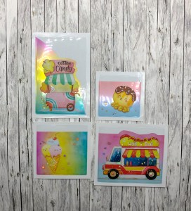
The pockets had different seizes and different motives on it. One is with a little octopus, the second with ice cream, the third has a hot dog truck on it, and the fourth one has the cotton candy stand on it. Even for the pockets the colour gradients are different but still the same as the notebook and the paper had. The drawings are amazing, but I didn’t understand why there have to be so many different backgrounds.
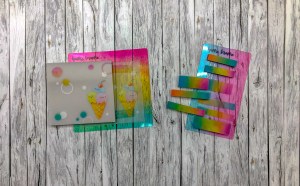
The washi cards have different motives and different colour gradients but all colours matched the other products backgrounds. My favourite washi card is the flower stand. It is so amazing, so cute and there isn’t any colour in the background. The other three cards had a cute hot dog, the octopus or the ice cream on it. All three are really cute designs too.

The dots on the roll are rainbow colours which fitted well into the overall colour scheme. The paper is like washi, you can remove it without any adhesive residues. I like the seize because they weren’t too tiny.

The charm is the little cotton candy stand which is really cute.

The notepad and the sticky notes … well, I am disappointed because it didn’t stick to the back which was made for it.
The paper is like vellum or a sort of transparent paper. The top, where the glue is supposed to fix the sheets, it was deformed to a wave due to which it can’t stick to the back anymore. As a design there is an ice cream on it which is really cute. Unfortunately, I couldn’t write on it with the pen from the box or any other ballpoint pen. But when I use the pen on any other paper, the ink flow is great.
Even the colour gradients on the sticky notes were too much. For such a small piece of paper there was a lot of, maybe even too much, colour. And unfortunately not every sticky note stick to the paper.
The die cuts were the designs of Molly and I appreciated that they don’t have a colour gradient at the background. They are adorable. There is the flower stand, an ice cream shop, the cotton candy stand, the hot dog truck, and the takoyaki (Japanese fried octopus in a batter) stand. I was in love. A little bit later I realized that background wasn’t just transparent; no it was a kind of glitter all over it. You could see it best when you had a light source next to you.

The stickers I would like to divide into three groups.
The plastic ones are really hard and if you used use them on thin paper you would know exactly where the sticker would be. The dividers have the glittery background as well and all of them have the rainbow colour gradient. For such small stickers the colour code is really intense, maybe too intense for me.

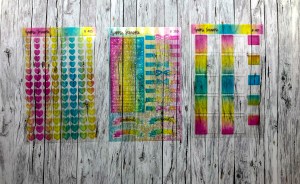
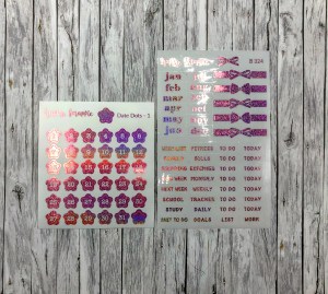

The date dot and monthly stickers were pink and really glittery. I am not a huge of pink… I know, not really girly-like, but I am not a typical woman 😉 So I am not sure if I will ever use them.
The last sticker group is printed on a plastic background. Honestly, I don’t understand why they did this because the weekly stickers are wavy which looks really bad. All the designs of Molly are on the stickers and everything is rainbow coloured.
My Final Thoughts
I loved my Happie Scrappie boxes beside all the trouble I had with them. The themes were great, everything matched together and it was really cute.
But while this nicely matched material gave me a laughing eye, the last box gave me a crying one – a little bit. It was too much, too much of everything. Too much colour, too many patterns, too much bad transparent sticky notes. On the other hand, the designs by Molly were absolutely amazing and very cute. I would wish that they would be more in focus, so that they could shine in their whole beauty.
Wisdom of the Day: Sometimes less is more.
Love to you all,
Chrissi
The Evil Journalista
